What’s Your Website Look Like On A Smartphone?
An “alarming” proportion of people are now connecting to websites using mobile devices! The latest stats (ABS Dec 2011) show there are now MORE people in Australia connecting to the Internet with a wireless connection, than those with ADSL.
On top of that… there are over 11 million Aussie subscribers with mobile phone internet connections!
Your business needs to cater to this mobile audience NOW, or you will lose customers to your mobile-savvy competition!
So what DOES your site look like to your mobile customers?
Check out Google’s GoMo Mobile Test Site you can see what your website looks like on a smartphone.
Answer a few questions and this tool also provides a PDF report on what’s working and what you could do better… e.g.:
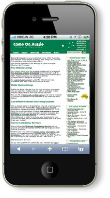 This Website on an iPhone4… a fail on many of these points (only 52% score on W3C Checker below)
GoMo reports at the following aspects, which are very important for mobile users…
- Is it QUICK to load – acceptable load time under 5 seconds.
- Are IMAGES appearing properly – not distorted or missing?
- Is Text visible WITHOUT zooming or pinching?
- Navigation – Are Links and Buttons BIG ENOUGH to be easily clicked by THUMBS?
If you believe that because people can SEE your desktop on a mobile phone, that everything is fine and you don’t need to do anything about it… PLEASE THINK AGAIN!!!
As you can see from the pic at right… this very site has “problems” when viewed on a smartphone!
It was slow to load… you’ll have to pinch, zoom and scroll a lot just to read the page… and the links are not at all very friendly for my big thumbs!
Depending on what type of business you are in, GoMo says the following may also be important:
- Are SEARCH functions easily accessible and working?
- Is your SHOPPING CART or PRODUCT/SERVICE MENU obvious/visible?
- Is your LOCATION visible?
- Is your PHONE NUMBER visible?
- Can your phone number be DIALLED with ONE CLICK?
- Are any/all other MEDIA used visible and working (particularly Flash)?
- Is the SITE STYLE consistent with other marketing materials?
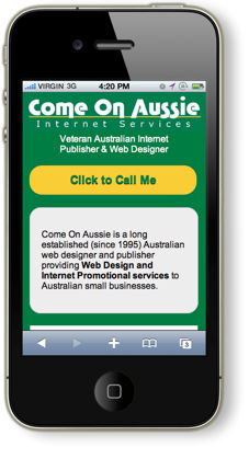 Same Site – Mobile Version – (much more respectable 93% score on W3C Checker below). Click to view in your normal browser (it works there too)The “same” website… actually a separate mobile version of Come On Aussie… is shown at right.
Lots simpler… quick loading, thumb friendly, click to call etc.
A totally different mobile user experience 🙂
And it implements most of the suggestions below… and as a bonus… it also works well in a “normal” web browser . Click to see for yourself.
So much so…
You may not even NEED to have a full blown desktop website for your business.
Some Extra Useful Suggestions
While the points listed above are the “basics”… I do have some additional suggestions for how you can make your mobile website even more user friendly:
- Put your BUSINESS NAME and/or logo at the TOP of each page (people who arrive at INTERNAL pages from search engines will have NO idea WHO you are otherwise)
- Have a CALL TO ACTION on EVERY PAGE
– if you want people to ring, then have a CLICK TO CALL BUTTON
– if you want quote/contact form filled in – LINK to it! - Decide which of your DESKTOP CONTENT IS MOST USEFUL to mobile users – not all of it may need to be included.
- Provide SIMPLER CONTENT by breaking up/reducing large blocks of text and/or using bullet points.
- Include OBVIOUS MAPS and address details so LOCAL people can visit!
- Allow people to GO BOTH TO AND FROM your Desktop & Mobile sites. Don’t lock them out of the alternative by using FORCED REDIRECTS.
- CHECK your website in both LANDSCAPE and PORTRAIT views on the mobile to ensure it works both ways.
- If possible, check your site on a TABLET to see what it looks like in that format.
Where/How to Check Further
The W3C mobileOK Checker will spit out a detailed report of potential “problems” your website (desktop of mobile) may need to have addressed to be viewed by a mobile user (note that some of the “Low” failures reported are often not that important).
Mobilizer is an EXCELLENT mobile preview app for your Windows or Mac Desktop computer. Well worth getting (if your PC has Adobe Air installed) for looking at how websites look in different phones.
More Information
If you’d like a free report on what might be needed to make your website mobile ready, then please don’t hesitate to contact me…
I look forward to hearing from you!
Cheers
Stephen Spry
« Is It Time For You To Get A Mobile Website? | Home | Mobile Website Predictions… »
-
Recent Blog Items
- Shared Hosting or Reseller Hosting – Which Do You Choose?
- My New Year “Purge” – The Aftermath
- Australian Web Directories in 2017 – Our “State of the Nation” Report
- HTTPS Runaround! Changes Needed ASAP
- How Do You Prevent Blatant Plagiarism?
- How to Improve on Your Organic Results
- 21 Years OnLine? Who Woulda Thought?
- New Website for the Aussie RV Traveller
- Shattering the Windows to Your Digital World!
- Busy Time For WordPress Community
- More Blog Posts
 Latest Aussie Websites
- Why Come On Aussie?
-
Leave a Reply